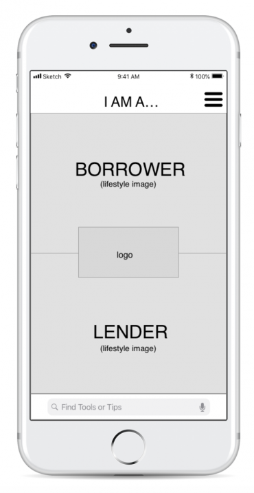
Helping DIYers help each other.
The Problem.
People are often asked to help out friends, relatives and neighbours with little jobs around the house.
They can’t always do it.
The Proposed Solution.
An application allowing people to find local help with little jobs.
The Process.
Competitor Analysis, User Research, Contextual Inquiry, User Interviews, Usability Testing, Personas, User Journey, Problem statement, Sketches, Prototypes
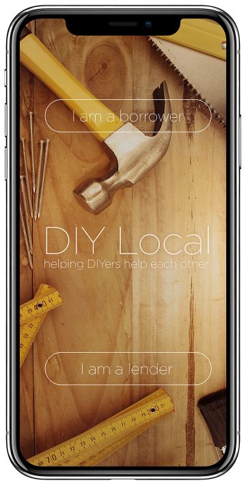
Discovery
Competitor Analysis.
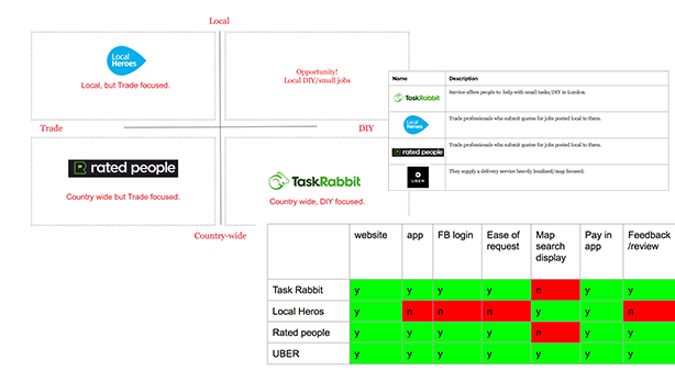
Looking at services that provide DIY/Handy Men.
I looked at other offerings in market that will find someone to help out with jobs at home but
- They are often very trade/professional focused
- The Search process onsite/app is often quiet long and detailed
- They are not locally focused
I also did an Indirect competitor analysis, using UBER, which delivers a service based on location/map/local. This suggested that a solution that features a MAP/Location mechanic could be an opportunity. Allowing people to find someone local who can help with a job.
User Research.
I then developed a comprehensive survey, asking users about:
1. Their experiences with DIY – Knowledge, skills, who helps, types of jobs.
2. The process of finding help – Apps, websites, local, recommendations.
3. Tasks – common jobs
4. Tools – experience, with, access too, useage
5. Payment & Trust – cash vs online payment, tradesmen and skills
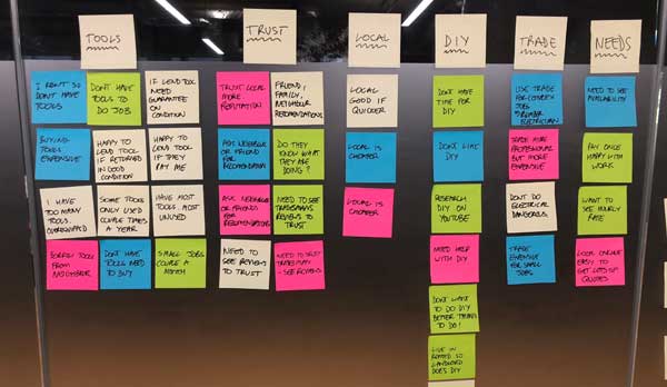
The data from these surveys was then used to do Affinity Mapping.
The key learnings from this were that:
1. Many people are generally happy to do DIY.
2. Lack of right tools or knowledge for the task is a problem.
3. Some users don’t like having to go and buy a tool they might never use again.
4. Trade seen as necessary for more complex/dangerous jobs like plumbing/electrical.
5. Some people have a lot of DIY experience. They also have a lot of tools that don’t get used much.
Pivot – New Problem Definition
Initially I thought the problem was about getting someone round to help to do DIY/small jobs, but after analysing the user research, it seems there were two types of users.
1. The first group were generally younger and less well off. They were happy to have a go at small DIY tasks but often lack the right tools or knowledge.
2. The second group were generally older, and often had years of DIY experience and a lot of tools and equipment that often did not see much use.
This meant we had to pivot as a new problem defintiton had presented itself from the user research.
Users are happy to do some DIY but often lack the knowledge or tools to do this.
Competitor Analysis 2.
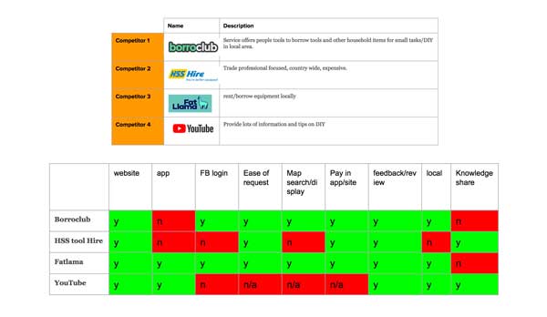
With the new problem definition I then looked at services that provide the ability to borrow tools or knowledge for DIY tasks.
The competitors identified were: Borroclub, HSS Tool Hire, Fat Lama and YouTube. YouTube were added as a competitor as they were mentioned by several users as a source of knowledge on how to achieve tasks.
There are other offerings in market that will allow people to rent tools, and share advice/knowledge, but
- They are often very trade/professional focused.
- They are not always local/community
- They don’t all offer how to/knowledge share
Opportunity for a solution that is:
- Local/community focused
- Offers easy Tool lending
- Knowledge sharing, DIY tips
Define
Personas
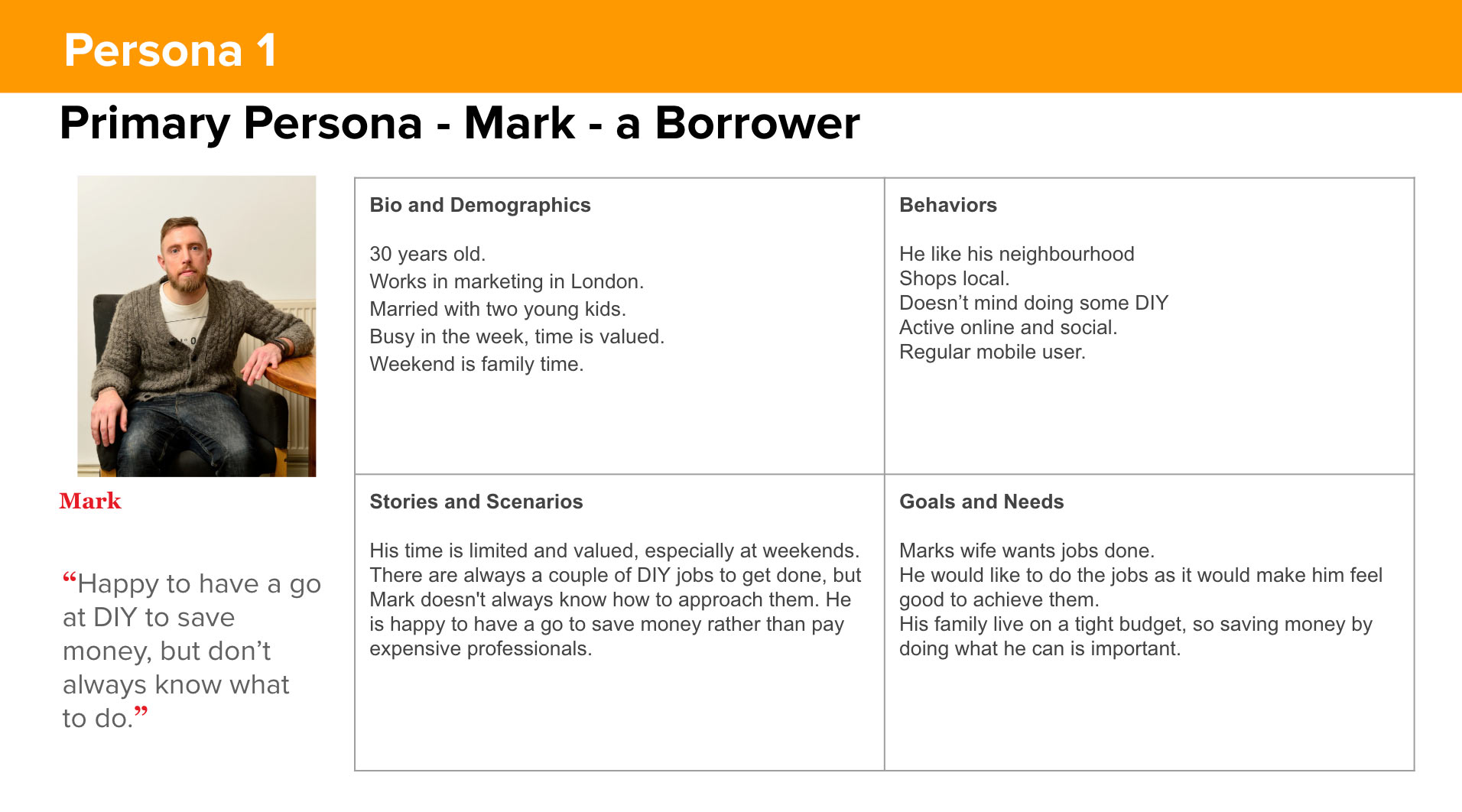
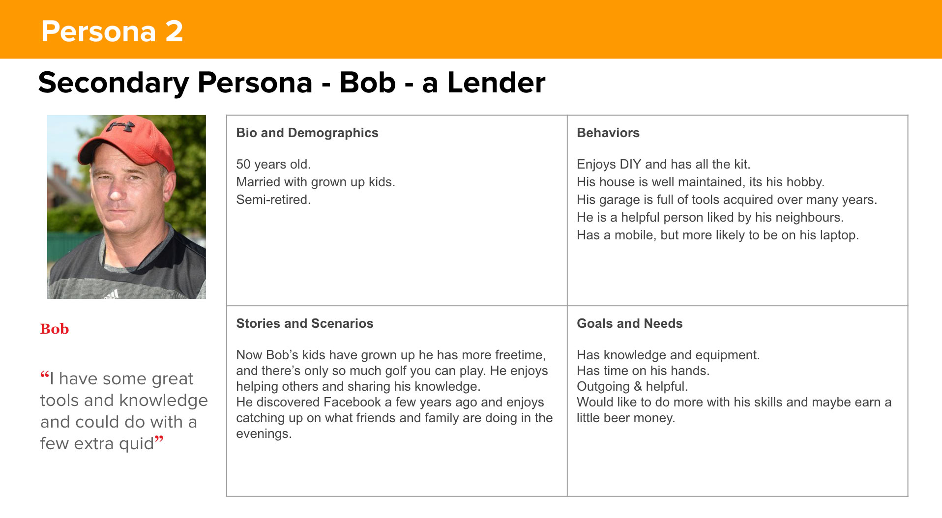
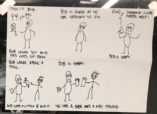
From our user research it was clear we had two different personas. A borrower of tools and knowledge, and a lender of tools and knowledge.
Develop
User Journey
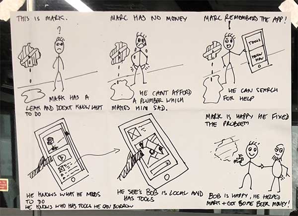
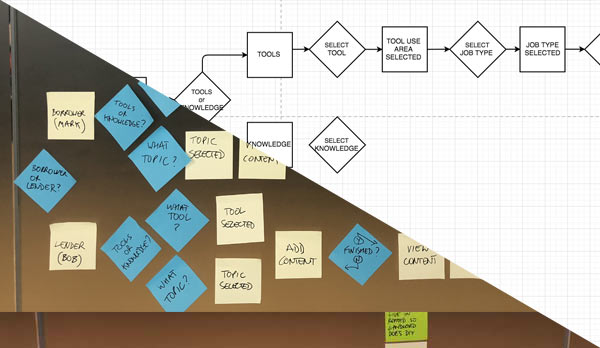
We mapped out the basic user journeys for both borrowers, and lenders of tools and knowledge, and worked out the core structure for how the various content buckets should sit within the overall site structure.
Card Sorting
To research how information could be grouped within the solution I carried out an Optimal Workshop card sorting with 6 users.
This raised a couple of issues I then addressed.
Firstly, some users don’t know what a lot of the tools actually are, eg.
‘Whats a plane?’
‘I’m not sure what a grout scraper is?
This supported the decision to base the user selection on where/how they use tools (eg Garden tools, rather than what the tools actually are).
Secondly, users should still be able to search by name if they know what they want, and so a search tool bar was added.
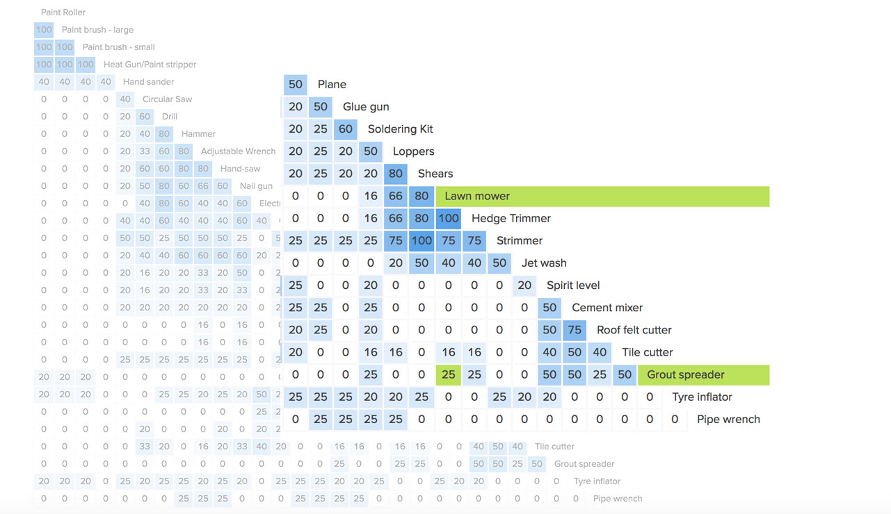
For Example: 50% of users grouped Grout spreader with Tile cutter which was OK, but 25% grouped it with lawn mower or Hedge Trimmer
Ideation
From our user research it was clear we had two different personas, we therefore needed to think about how these users would interact with the solution.
Our primary persona Mark, the borrower, is a predominantly a mobile user, but also in an immediate need state when engaging with this solution. To fully utilise location and other data services this solution should be a mobile app.
For our secondary persona, Bob, the lender, he is more likely to be a desktop user with more time on his hands. A website would be his main way of engaging with this solution.
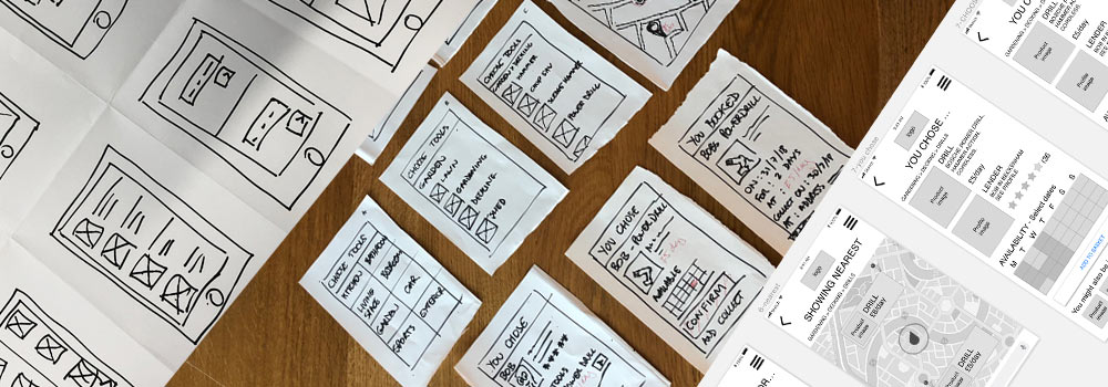
I focused on Mark the primary persona, and worked up several differnet ideas for solutions which were then developed into paper prototypes.
I then carried out three rounds of user tests with paper prototypes, refining the user journey and experience each time.
Deliver
Protoypes
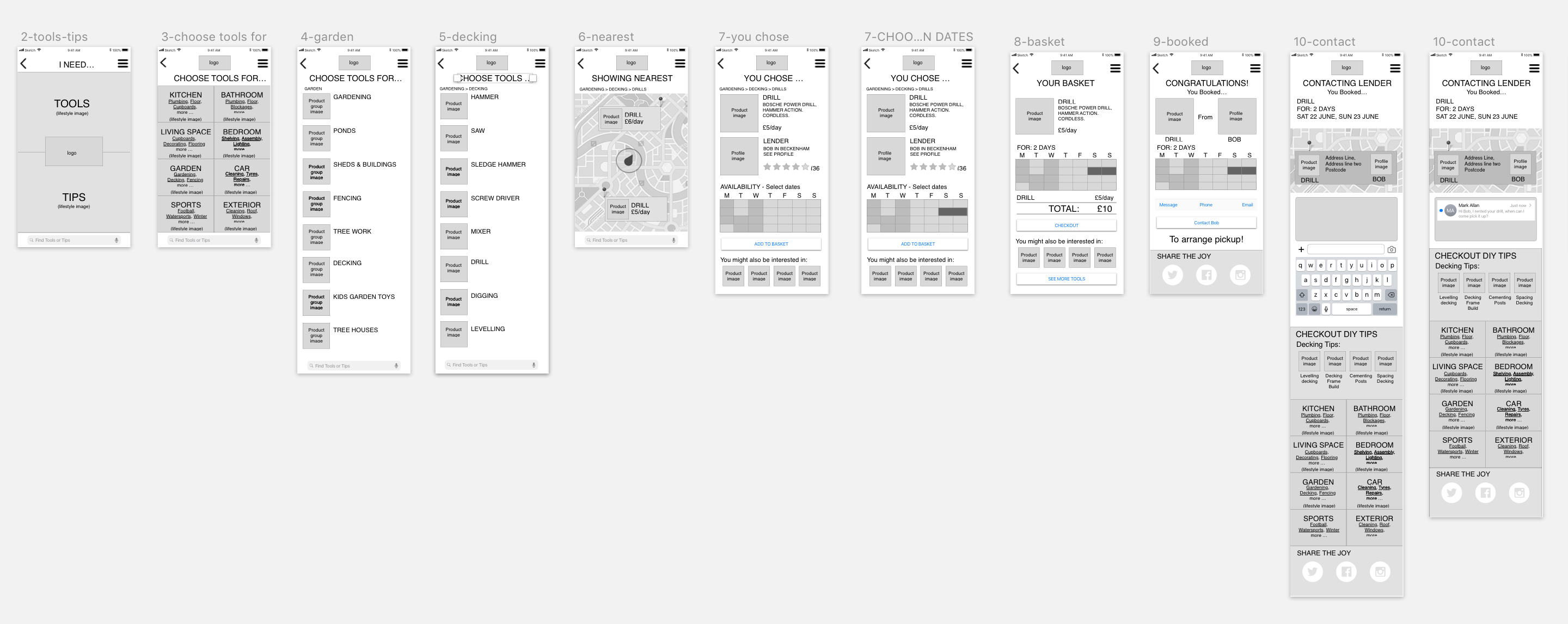
I then moved into Sketch to produce the medium-fidelity prototypes, and clearly layout the core functionality across multiple screens to illustrate the primary persona user journey.
This was then tested, and refined with 3 separate user test which were recorded to ensure as much user feedback was gathered as possible.
Interactive Prototype
Finally I built an interactive prototype in Marvel illustrating ‘the happy path’ for Mark, the borrower.
Scenario:
The sun is shining. Mark has friends coming round on Sunday for a BBQ. He notices that the decking needs fixing, but he doesn’t have a drill.
Hold on…there’s a really cool app he heard about where you can borrow tools locally…
Mark opens the app to borrow a drill to fix the decking: https://marvelapp.com/17fh1a36/screen/44953005
Next Steps
Learnings from interactive demo:
Too much detail can be confusing.
Direct search bar not clear enough and needs friendlier language.
Social sharing important to add for growth.
1st stage MVP: would allow users to lend and borrow tools locally using paypal commission to fund.
2nd stage product: add in the knowledge sharing functionality, both user generated and produced by affiliated sponsors or companies.
3rd stage: build in revenue display advertising model.
